Hill College is committed in providing those with and without disabilities access to all content and services that are offered. This page provides the resources and recommended accessible elements that meet the Web Content Accessibility Guidelines (WCAG 2.0) along with the Section 508 standards. The Hill College website exceeds the accessible benchmarks and will continue to improve and sustain this initiative. The Hill College vision and goal is making our site accessible to all faculty, students, staff and visitors.
Introduction to Web Accessibility
Hill College aligns its strategies and standards with the World Wide Web Consortium (W3C). To better understand the concepts that are applied to developing an accessible website, W3C summarizes web accessibility nicely in their Web Content Accessibility Guidelines 2.0 (WCAG) video.
Web Accessibility for Designers Infographic

How To use the Source Code Tool
Buttons
Copy & Paste code:
<div style="text-align: center;"><a class="slide-button alt" href="https://www.hillcollege.edu">HC Theme Button</a></div>
All that will need to be done is to edit the URL or path ("href" is where the URL and/or path to the file will be added. Everything inside the quotes is where you plug in the url or path, don't delete the quotes) and text on the button.
Accessible PDF
A document or application is considered accessible if meets certain technical criteria and can be used by people with disabilities. This includes access by people who are mobility impaired, blind, low vision, deaf, hard of hearing, or who have cognitive impairments. The PDF is an accessible sample. All PDFs need to be accessible prior to publishing online.
Note: These Best Practices techniques require access to Adobe Acrobat Pro DC. Adobe Acrobat Reader DC and Adobe Acrobat Standard DC do not have the complete set of tools needed to create and validate PDF documents for accessibility.
Accessible Tables
This table is a responsive, bordered, and accessible example.
| First Name | Last Name | Hero Title |
|---|---|---|
| Bruce | Wayne | Batman |
| Peter | Parker | Spiderman |
| Bruce | Banner | The Hulk |
| Clark | Kent | Superman |
<table class="table table-bordered"><caption><strong>Testing Center Contacts</strong></caption>
<thead class="thead-dark">
<tr>
<th scope="col">First Name</th>
<th scope="col">Last Name</th>
<th scope="col">Hero Title</th>
</tr>
</thead>
<tbody>
<tr>
<td>Bruce</td>
<td>Wayne</td>
<td>Batman</td>
</tr>
<tr>
<td>Peter</td>
<td>Parker</td>
<td>Spiderman</td>
</tr>
<tr>
<td>Bruce</td>
<td>Banner</td>
<td>The Hulk</td>
</tr>
<tr>
<td>Clark</td>
<td>Kent</td>
<td>Superman</td>
</tr>
</tbody>
</table>
</div>
This is a Hoverable Row table. Table is designed to be responsive, hover state on rows, accessible attributes and with a colspan attribute.
| # | Team | Town | Division |
|---|---|---|---|
| 1 | Sharks | Austin | Central |
| 2 | Dust Devils | San Antonio | South |
| 3 | Stars | Dallas | North |
| Games will start at 9:00am. | |||
<thead>
<tr>
<th scope="col">#</th>
<th scope="col">Team</th>
<th scope="col">Town</th>
<th scope="col">Division</th>
</tr>
</thead>
<tbody>
<tr>
<th scope="row">1</th>
<td>Sharks</td>
<td>Austin</td>
<td>Central</td>
</tr>
<tr>
<th scope="row">2</th>
<td>Dust Devils</td>
<td>San Antonio</td>
<td>South</td>
</tr>
<tr>
<th scope="row">3</th>
<td>Stars</td>
<td>Dallas</td>
<td>North</td>
</tr>
<tr>
<td colspan="4">Games will start at 9:00am.</td>
</tr>
</tbody>
</table>
Image
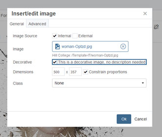
Decorative Image Sample
The "alt" tag is empty, Code:
<img alt="" caption="false" class="" src="" width="500" height="357" />

For a decorative Image, select "decorative image" before clicking "OK" on the edit image dialog screen. See below:
Images used to supplement other information
The above image is a supplement for the content of the page, notice that the "alt" tag has a description of the image, below:
<img alt="Edit image dialog box with decorative image selected" caption="false" class="" src="" width="331" height="279" />
Icon image that has a function (hyperlinked)

Links
jspicer@sample.com or jspicer@sample.com
Refrain from using "click here",
Avoid This: "please click here for more transcript information" (here being the link).
Practice This: "Please reference our transcripts page for more information" - Use informative link phrases.
In some cases it may make sense to precede a link phrase with "more" or "read more about," (e.g. "more about college scholarships"), but if these extra words can be avoided, it is probably best to avoid them (e.g. "college scholarships" may convey the same meaning as "more about college scholarships," depending on the context).
Link Requirements
- Links should be either Bold or Underlined.
- It's recommended that no more then 60 links be added to internal pages.
- Use destination page name.
- If a link is to a file, such as a PDF or Word document, Provide that information in the link text (e.g., "Sping schedule PDF") so users know what to expect.
Example:
"Admissions" In the nav-bar on top of pages should point to the same location as the "Admissions" listed in the side-nav.
Challenges for users when using web addresses and URLs are readability and length.
URLs are not always human-readable or screen-reader friendly. Many URLs contain combinations of numbers, letters, ampersands, dashes, underscores, and other characters that make sense to scripts and databases but which make little or no sense to the average person. In most cases, it is better to use human-readable text instead of the URL. The human readable link Building Accessible Websites is more user-friendly than the link to purchase the book by the same title on Amazon.com, which consists of a 108-character link full of numbers, slashes, and text that is not very human-readable. (http://www.amazon.com/Maximum-Accessibility-Making-Usable-Everyone/dp/0201774224/ref=sr_1_13?keywords=Accessible+Web+Sites&qid=1563888961&s=books&sr=1-13)
Does this mean that URLs should never be used as links? No. If the URL is relatively short (such as a site's homepage), the URL may be used as the link text. The key is to be considerate of screen reader users who must listen to the longer, less intelligible URLs.
Color
Color and contrast are both vital when we are talking about web accessibility. There are three success criteria in WCAG 2 that address contrast.
- 1.4.3 Contrast (Minimum)
- 1.4.6 Contrast (Enhanced)
- 1.4.11 Non-text Contrast
- One additional is the 1.4.1 use of Color, which we discussed in the Link section.
| 1.4.3 Contrast (Minimum) | 1.4.6 Contrast (Enhanced) | 1.4.11 Non-text Contrast Hero Title |
|---|---|---|
| This is a Level AA requirement | Level AAA requirement | WCAG 2.1 was published in June 2018. One new 2.1 success criterion moves contrast beyond just text. 1.4.11 Non-text Contrast (Level AA) reads: |
|
The visual presentation of text and images of text has a contrast ratio of at least 4.5:1, except for the following:
|
The only difference between this Level AAA success criterion and Level AA 1.4.3 is that contrast requirements are more stringent. It requires 7:1 contrast for normal text and 4.5:1 for large text. Although higher contrast is often recommended, we focus on 1.4.3 compliance throughout this article. |
The visual presentation of the following have a contrast ratio of at least 3:1 against adjacent color(s):
|
We must keep in mind that color blindness affects approximately 1 in 12 men and 1 in 200 women worldwide. this can affect users who have cataracts, low vision, or are in poor lighting situations.
Color/Contrast Requirements:
- If a user needs to select a color from a group of swatches, label the color names on the page or item.
- Avoid color-banded rows in tables, they can cause problems when the background and foreground don't have a high enough contrast ratio.
- Color in Graphs, Use patterns or various shades so that color-blind users can distinguish them. Adding a legend or labels near each element is also helpful.
- Referring to Color, don't refer to the color of an object as the only attribute. E.g., instead of saying "select the red button," say "select the red stop button." Button also has the universal square shape in the button.
Accessibility Contact
If you have any questions regarding accessibility and/or any of the defined elements above, please contact:
Steve Zimmerman
Web Administrator
254.659.7849
Email Contact